Is San Francisco Safe in 2026? A Neighborhood Answer
San Francisco averages 3.9 of 5 on Houseberry’s safety scores, above every nearby city, while its lowest scores cluster in a couple of downtown square miles. The 2026 map, explained.
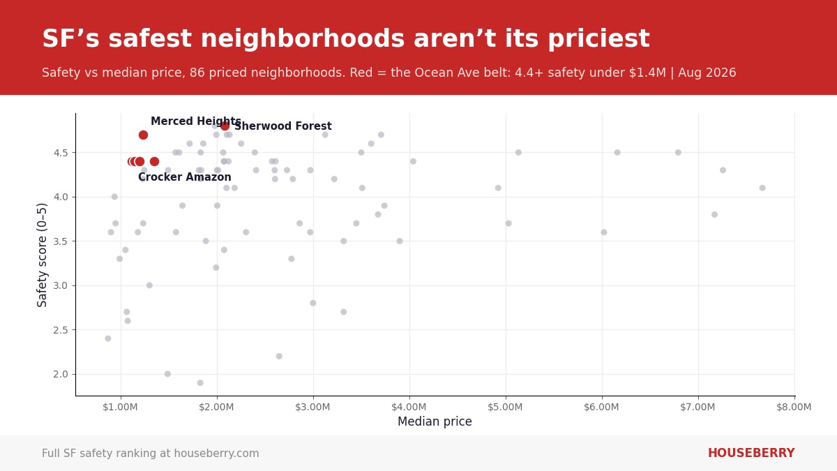
Scatter chart answering is San Francisco safe in 2026: neighborhood safety scores against median prices, highlighting five neighborhoods near Ocean Avenue that score 4.4 or higher for safety under $1.4 million. Photo: Houseberry
The San Francisco a visitor sees is Union Square, Market Street, and a cable car turnaround. The San Francisco most residents live in is a fog-cooled grid of two-story houses a 25 minute train ride west. On Houseberry’s 2026 safety scores those are practically different cities, and that gap is the real answer to whether San Francisco is safe. The city averages 3.9 out of 5 across 92 scored neighborhoods, higher than any of its five nearest cities, and its lowest scores concentrate in roughly two square miles downtown.
Every number here comes from Houseberry’s San Francisco safety ranking, which scores all 92 neighborhoods and updates as new incident data lands. Here is what the map actually shows.
The question is mostly about two square miles
Take the eight lowest safety scores in the city: Van Ness and Civic Center at 1.5, South of Market at 1.9, the Inner Mission at 2.0, the Tenderloin at 2.1, Yerba Buena at 2.2, the Financial District at 2.3, and Downtown and Bayview at 2.4. Seven of the eight sit shoulder to shoulder in the downtown core east of Van Ness Avenue. That pocket is where the tourism, the office towers, the transit hubs, and the news cameras all concentrate, so it does most of the talking for a city where it holds a small fraction of the housing. Only Bayview, in the southeast, sits outside that pocket, a reminder the pattern is strong but not absolute.
Fifty-three neighborhoods score 4.0 or better
Here is the stat that never makes the headlines. As of August 2026, 53 of San Francisco’s 92 scored neighborhoods, a full 58 percent, score 4.0 or higher for safety, and the citywide average of 3.9 beats the 3.3 average of the five nearest cities on the same scale. The top of the table is a west side sweep. Sherwood Forest and Westwood Park share the city’s highest score at 4.8, followed by a 4.7 band that includes Midtown Terrace, Monterey Heights, Forest Knolls, and Merced Heights. All 21 neighborhoods scoring 4.5 or higher sit on the western half of the city, in the quiet single-house belts around Mount Davidson, Ocean Avenue, and the Richmond.
The Ocean Avenue belt is the value story
The median home in that 4.5-plus tier costs about $2.1 million. The interesting part is the small band that breaks the pattern. Five neighborhoods in the city’s southwest corner score 4.4 or higher for safety with medians under $1.4 million, per Houseberry’s August 2026 data:
| Neighborhood | Safety score | Median price |
|---|---|---|
| Merced Heights | 4.7/5 | $1.23M |
| Crocker Amazon | 4.4/5 | $1.12M |
| Oceanview | 4.4/5 | $1.15M |
| Ingleside Heights | 4.4/5 | $1.20M |
| Sunnyside | 4.4/5 | $1.35M |
Merced Heights is the standout, a hilltop grid above Brotherhood Way whose 4.7 matches neighborhoods asking twice its price. Crocker Amazon and Oceanview run along the Balboa Park BART orbit, and Sunnyside hides between Glen Park and City College. These blocks stayed affordable because the fog belt and a long-outdated reputation kept demand looking elsewhere. The safety data caught up before the prices did. To see how the whole southwest ranks on every factor, compare all 92 neighborhoods on the ranking page.
The Sunset and the Richmond hold the middle, and the middle is high
Between the 4.7 hilltops and the downtown core sits the version of San Francisco most residents actually inhabit, the fog-belt avenues, and the scores there stay strong block after block. Central Sunset and Central Richmond both read 4.5 for safety. The Outer Sunset reads 4.3 at a $1.49 million median, the least expensive 4-plus safety score north of Ocean Avenue, and the Inner Richmond holds 4.4 with Clement Street’s food corridor built in. These are not exceptions. They are roughly forty contiguous blocks-wide bands of 4.3 to 4.6 territory, which is why the citywide average lands at 3.9 despite everything downtown. The Outer Sunset is also where the city is adding ocean-side housing, a shift we covered in our piece on the 199 homes coming to the Great Highway.
The southern middle band deserves its own sentence. Bernal Heights reads 3.5, the Excelsior 3.4, and Portola 3.7 as of August 2026, solidly mid-table rather than low, with Portola and the Excelsior among the few areas still posting seven-figure medians that start with a 1.0 or 1.2. On this map, mid is not a warning label. Mid is most of the city, and it sits closer to Marin’s numbers than to downtown’s.
Three Missions, three different answers
San Francisco safety questions go wrong through name confusion, and the Mission is the best example. The Inner Mission, the dense corridor along 16th and 24th Streets, scores 2.0. Mission Dolores, ten minutes west by foot, scores 3.8. Mission Terrace, down by Balboa Park, scores 3.6. One name, three neighborhoods, a 1.8 point spread. The same is true downtown, where Mission Bay at 3.9 outscores every neighborhood that borders it. Anyone telling you what “the Mission” is like is averaging things that should not be averaged.
What cuts against the rosy reading
Two honest caveats. First, the low-scoring pocket is exactly where visitors, commuters, and new arrivals spend their first months, so their experience of the city is real even if it is unrepresentative. Second, these scores read reported police incidents normalized by population, and downtown daytime crowds mean more reports against fewer residents, which pushes scores down hardest exactly where foot traffic peaks. The score is honest about what it measures. It measures reports, not vibes, and it cannot promise any block a quiet night.
Where this is heading
Downtown is the moving piece. Office-to-housing conversions are slowly adding residents to the exact blocks where the resident denominator has been thinnest, and we covered what that looks like on the ground in our look at living downtown in 2026. More residents typically means more eyes, more open storefronts, and, mechanically, better per-capita numbers. The west side, meanwhile, has little room left to improve. If the 2027 version of this map looks different, the change will have happened east of Van Ness.
How we scored it
Houseberry scores 92 San Francisco neighborhoods on a 0 to 5 safety scale built from reported incident data normalized by population, alongside scores for schools, amenities, price, value, and appreciation. Figures cited are as of August 4, 2026. Neighborhoods whose prices fall back to citywide figures were excluded from price claims. San Francisco’s underlying incident data is published by the city at DataSF. The live table is on the San Francisco safety ranking.
Quick answers
Which San Francisco neighborhoods score highest for safety in 2026? Sherwood Forest and Westwood Park share the top score at 4.8 out of 5, followed at 4.7 by Midtown Terrace, Monterey Heights, Westwood Highlands, Merced Heights, Pine Lake Park, and Forest Knolls, all on the city’s west side.
How does downtown San Francisco score? Lowest in the city. Van Ness and Civic Center scores 1.5, South of Market 1.9, and the Tenderloin 2.1 as of August 2026. The downtown core east of Van Ness holds seven of the city’s eight lowest safety scores.
What is the most affordable neighborhood with a high safety score? Crocker Amazon, at a $1.12 million median with a 4.4 safety score. Oceanview, Ingleside Heights, and Merced Heights all land within $110,000 of it with scores of 4.4 to 4.7.
Is the Sunset safe? The Sunset districts score 4.3 to 4.5 for safety across the board as of August 2026, with Central Sunset and Outer Parkside at 4.5 and the Outer Sunset at 4.3. It is one of the largest contiguous high-scoring areas in the city.
Is the Mission safe? Which one? The Inner Mission scores 2.0, Mission Dolores 3.8, Mission Terrace 3.6, and Mission Bay 3.9. The name covers four neighborhoods whose safety scores differ by nearly two full points, so check the specific blocks you mean.
Does San Francisco score better than nearby cities? On average, yes. The citywide average is 3.9 out of 5 against a 3.3 average across the five nearest cities, per Houseberry’s August 2026 scores.
Ready to check a specific block? Open the San Francisco map and click any neighborhood for its full scorecard.
Map of San Francisco Neighborhoods
Loading map...
View Full Map
Top Neighborhoods in San Francisco, CA





All information provided on this website including but not limited to - school ratings, safety, amenities, user opinions, and property data - is for general informational purposes only. We do not guarantee its reliability, accuracy, or completeness. Users should independently verify information and consult appropriate professionals as needed. By using this website, you agree Houseberry is not responsible for actions, decisions, or consequences arising from reliance on the information provided
houseberry.com - CA DRE# 01847391
 Bay East ©2025. CCAR ©2025. bridgeMLS ©2025. Information Deemed Reliable But Not Guaranteed. This information is being provided by the Bay East MLS, or CCAR MLS, or bridgeMLS. The listings presented here may or may not be listed by the Broker/Agent operating this website. This information is intended for the personal use of consumers and may not be used for any purpose other than to identify prospective properties consumers may be interested in purchasing. Data last updated at September 18, 2026 12:00 AM