The Bay Area neighborhoods in flood zones before El Niño hits
We laid FEMA's flood map over 1,213 Bay Area neighborhoods. Here are the ones with the most land in the high-risk zone, the ones on higher ground, and what to do before a record El Niño winter.

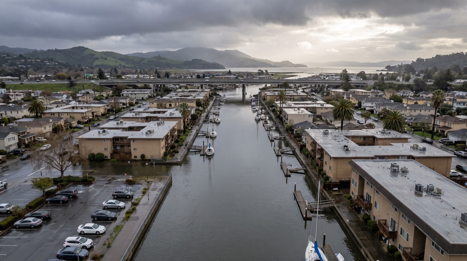
AI-rendered aerial view of the San Rafael Canal District in Marin at a high winter tide under storm clouds Photo: Houseberry
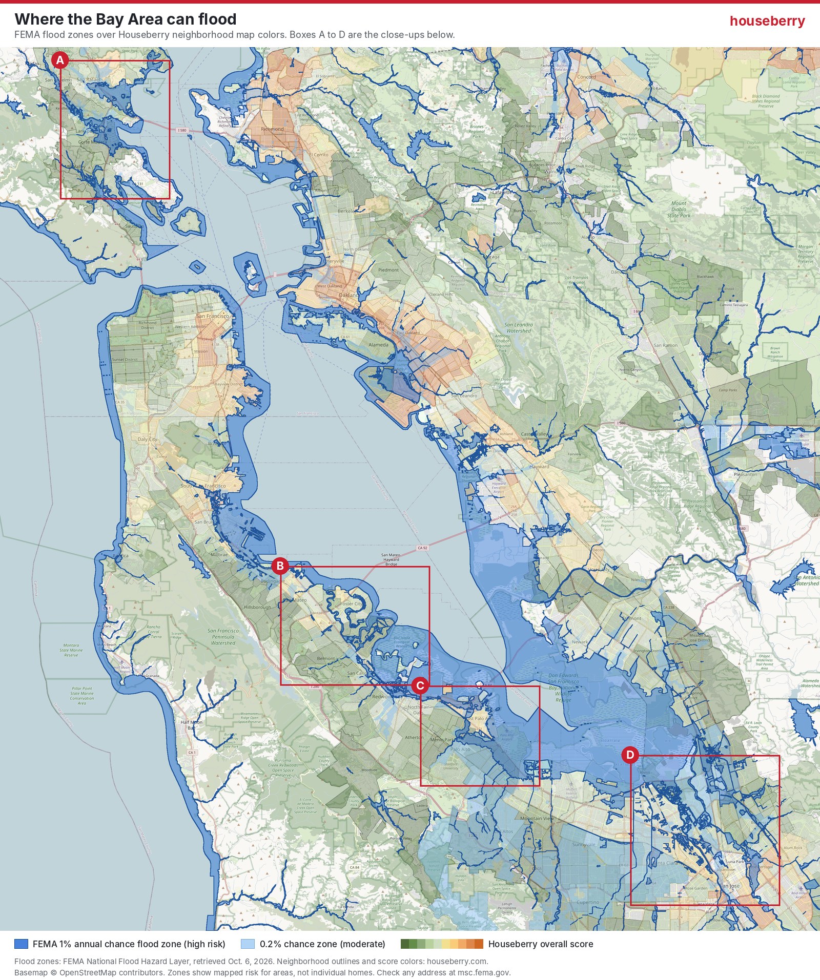
We laid FEMA's flood map over all 1,213 Houseberry neighborhoods between Marin and South San Jose. In 591 of them, essentially none of the land sits in FEMA's high-risk flood zone. In 24, more than half of it does.
That split is the useful thing to know this fall. On September 21 a key Pacific temperature reading hit 3.11 degrees Celsius above normal, beating the daily record set in November 2015, Carbon Brief reported. Governor Newsom declared a statewide emergency the same day. Sonoma County followed with its own proclamation on October 6. Whether this winter turns wet or not, scientists expect El Niño to push the bay higher than usual, and the higher the bay sits, the more a storm or a king tide has to work with.
So here is where the water is mapped to go, neighborhood by neighborhood, with the Houseberry map colors underneath so you can see what kind of places they are.
How we built the map
The blue comes from FEMA's National Flood Hazard Layer, which we pulled on October 6, 2026. Dark blue is the 1% annual chance zone, the one lenders call high risk and the one that triggers required flood insurance on a federally backed mortgage. Light blue is the 0.2% zone, a step down. The green-to-orange shading underneath is Houseberry's overall neighborhood score, the same colors as our live map.
For each neighborhood we measured what share of its area falls inside each zone. Two cautions before you read the numbers. A creek channel or a lagoon counts as area, so a neighborhood wrapped around water can show a share even when few homes are wet. And FEMA's map is a regulatory document that can lag behind new levees and new science. It is the floor of what to check, not the ceiling.
Four places the map turns blue
The close-ups below match the lettered boxes on the regional map.
A. Southern Marin, where king tides already arrive
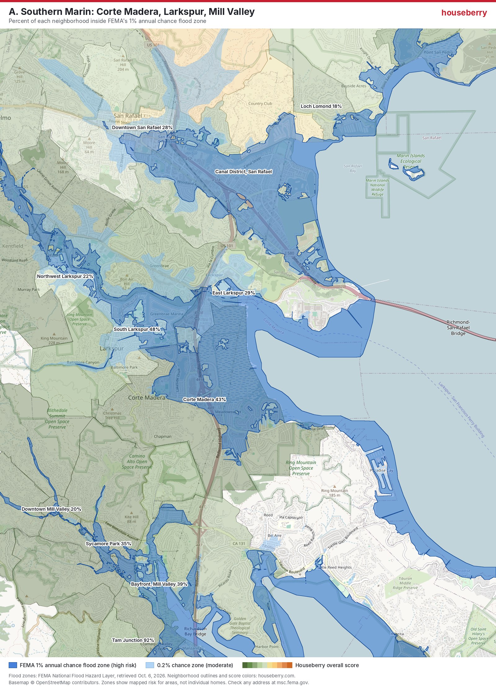
Tam Junction, the low strip around Shoreline Highway at the foot of Mill Valley, tops the whole Bay Area list among residential areas at 92 percent. South Larkspur is at 48 percent and Corte Madera at 43, most of it the flat land east of Highway 101 that was marsh a century ago.
San Rafael's Canal District does not have its own Houseberry outline, but the map shows it plainly: the whole grid east of 101 is blue. KQED reported that about 10,000 people live in that bowl, much of it below sea level. "We're already looking at over 8-foot tides for king tides plus winds, storm surge, and rain potential," San Rafael's deputy emergency director Quinn Gardner told KTVU on October 5. Marin is spending about $5 million to get ready, including $2.27 million for barriers, sandbags, tide gates and drains.
This is not hypothetical here. The January 3, 2026 king tide ran 2.5 feet above prediction at the San Francisco gauge and flooded about 200 Marin properties.
B. San Mateo, Foster City and Redwood Shores
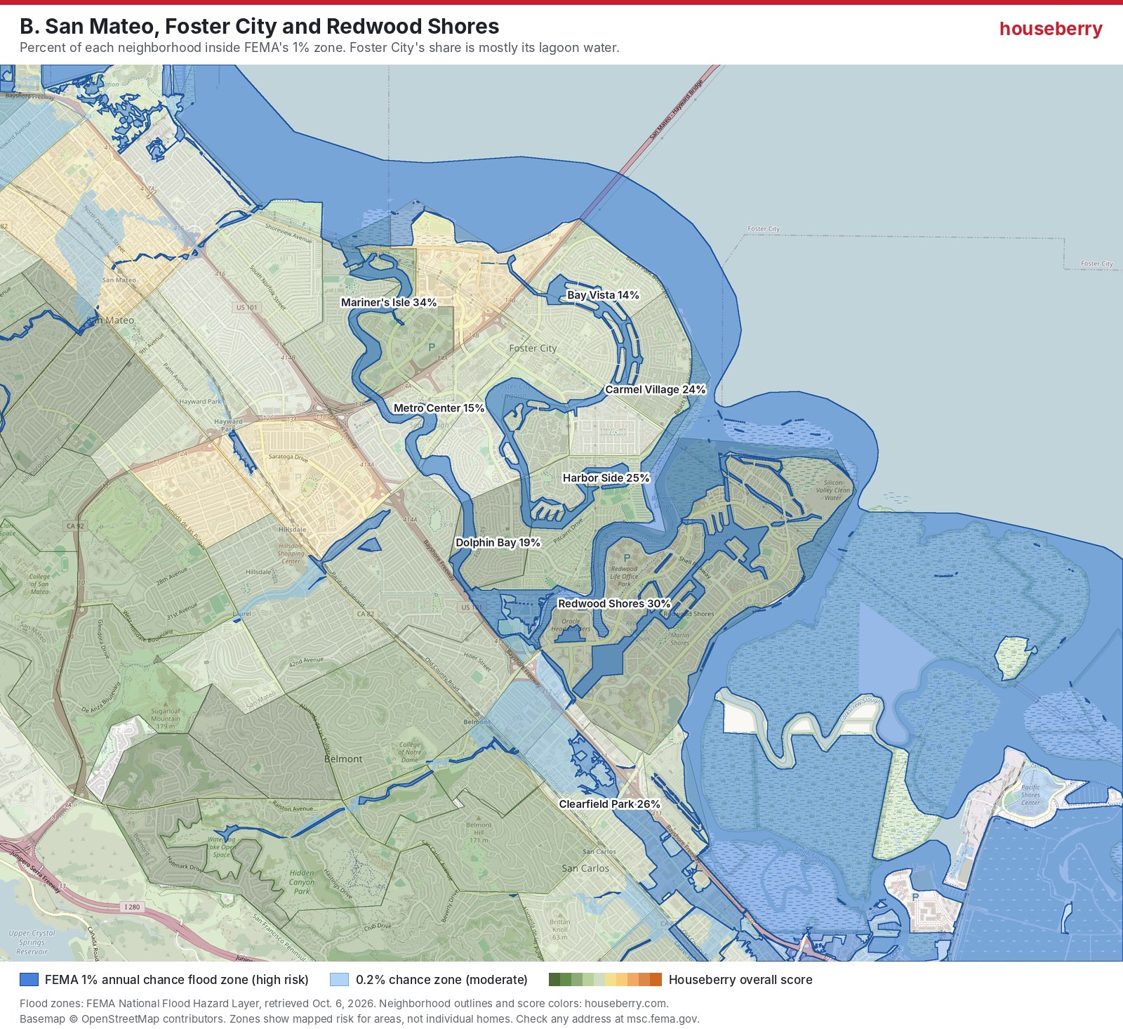
This map is the good-news panel. Foster City finished a roughly $90 million levee raise in February 2024, and FEMA's map now treats most of the city as protected. Without it, owners faced an estimated $2,000 to $3,000 a year in mandatory flood insurance, according to the city's own FAQ. The 14 to 27 percent shares you see on Foster City neighborhoods like Sea Colony are mostly the lagoons themselves.
San Mateo did the same thing on a smaller scale. About 1,600 properties in North Shoreview and North Central came off the flood map after a levee raise and pump station upgrades, the San Mateo Daily Journal reported. On today's map, North Shoreview is at 18 percent and Mariner's Isle at 34.
Redwood Shores is at 30 percent. It also has a more serious long-term problem than its FEMA share suggests: a 2025 analysis cited by San Mateo County's flood agency, OneShoreline, ranked Redwood City as the California city at highest risk of severe coastal flooding.
C. North Palo Alto and the creek that keeps rising
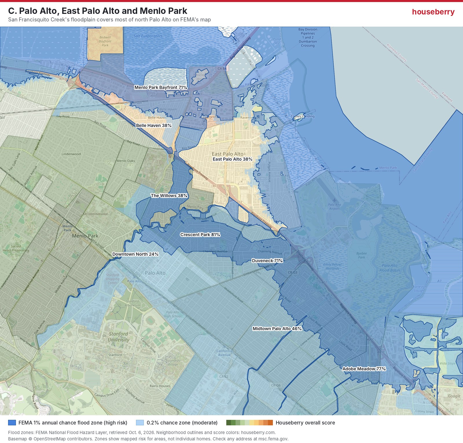
Palo Alto is the surprise for people who think flood risk means the shoreline. Four of its neighborhoods have more than 70 percent of their land in the 1% zone: Crescent Park at 81, Adobe Meadow at 77, Palo Verde at 74 and Duveneck and St. Francis at 71. The reason is San Francisquito Creek. On February 3, 1998 it flooded about 1,700 properties in Palo Alto, East Palo Alto and Menlo Park. On December 31, 2022 it peaked at 7,420 cubic feet per second, higher than in 1998, and spilled near Duveneck School when debris jammed the Pope-Chaucer bridge, the Palo Alto Daily Post reported.
Across the creek, Belle Haven in Menlo Park sits at 38 percent, the same as East Palo Alto as a whole. Their bay levee project, SAFER Bay, is still in design. We wrote about Palo Alto's own shoreline plan in our look at the Baylands living levee.
D. Alviso and the Coyote Creek corridor in San Jose
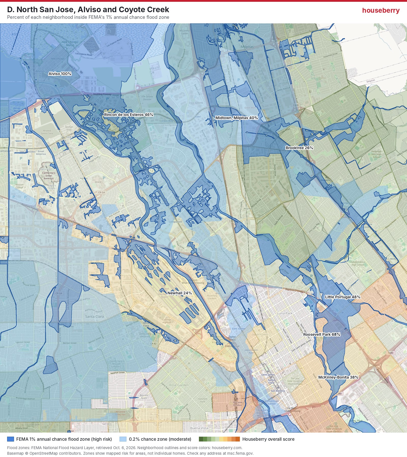
Alviso is 100 percent inside the zone. The old town at the southern tip of the bay sits low behind levees, and it flooded in 1983. A new shoreline levee built for a 100-year coastal storm protects about 5,500 people in Alviso and North San Jose, according to Valley Water.
The inland line is Coyote Creek. In February 2017 it overflowed and forced about 14,000 people to evacuate, with about $73 million in damage, SPUR reported. Roosevelt Park is at 68 percent today, Little Portugal at 48 and McKinley-Bonita at 38. Valley Water's fix is half built. Phase 2 runs through 2028, which means this winter arrives before it is done.
The 15 neighborhoods with the most land in the flood zone
Leaving out airports, open baylands and anything under 20 acres, these are the Bay Area residential areas with the largest share of land in FEMA's 1% zone.
| Neighborhood | City | Share in 1% zone | Share in 0.2% zone |
|---|---|---|---|
| Alviso | San Jose | 100% | 0% |
| Tam Junction | Mill Valley | 92% | 5% |
| The Lagoon | Belvedere Tiburon | 90% | 4% |
| Crescent Park | Palo Alto | 81% | 19% |
| Adobe Meadow - Meadow Park | Palo Alto | 77% | 23% |
| Palo Verde | Palo Alto | 74% | 26% |
| Duveneck - St. Francis | Palo Alto | 71% | 29% |
| Bayfront | Menlo Park | 71% | 8% |
| Benson Rd | Union City | 71% | 0% |
| Roosevelt Park | San Jose | 68% | 1% |
| E 3rd St / Harbor St | Pittsburg | 68% | 5% |
| Empire St | Union City | 61% | 0% |
| Parkside-Willow | Pittsburg | 61% | 0% |
| Belle Air Park | San Bruno | 59% | 17% |
| Bay Point | Pittsburg | 57% | 0% |
Shares are Houseberry analysis of FEMA's National Flood Hazard Layer, October 2026. Our working file has all 1,213.
Where the higher ground is
San Francisco has 92 Houseberry neighborhoods. Only two, Hunters Point at 13 percent and the Outer Sunset at 11, have more than a tenth of their land in FEMA's zone. Oakland has five of 129, and those are the airport, the waterfront and the Embarcadero. In hillside towns like Lafayette, Saratoga and Hillsborough, no neighborhood tops 10 percent.
There is a catch in the San Francisco number. FEMA mapped the city's shoreline, not its streets. The city keeps its own 100-year storm map for rain that overwhelms the sewers, and the low spots on it, like 17th and Folsom in the Mission, have flooded in recent storms. Sellers and landlords have to disclose if a property is in that zone.
The hills have their own winter risk too. In the 1997 to 1998 El Niño, the U.S. Geological Survey counted about 300 damaging landslides in the Bay Area. Higher ground means lower flood risk, not no risk.
What we would do this month
We think the FEMA map should be the start of a buyer's check, not the end of it. The Neptune Flood report from April found that 45 percent of California's federal flood claims come from outside FEMA's high-risk zones, and that only 1.4 percent of California homes carry flood coverage at all. Most homeowner policies exclude flood. A new federal flood policy generally takes 30 days to start, so a policy bought this month is in force before Thanksgiving week, when Marin expects some of the highest tides of the year.
The other lesson is on the Peninsula map. Foster City and San Mateo spent real money on levees and pumps, and FEMA took thousands of homes out of the high-risk zone. That is the cheapest flood insurance there is.
Look up any address on FEMA's Map Service Center, then compare the neighborhood around it on the Peninsula ranking and the rest of the Houseberry map. Our August checklist on checking a home's flood risk before an offer walks through the rest.
Sources
- FEMA National Flood Hazard Layer, flood hazard zones layer, retrieved October 6, 2026
- NOAA Climate Prediction Center ENSO discussion
- Carbon Brief: super El Niño reaches all-time record
- KTVU: Marin County and San Rafael prepare for El Niño, October 5, 2026
- CBS San Francisco: Sonoma County emergency proclamation
- Insurance Business: only 1.4% of California homes carry flood insurance
The Houseberry Research Team is Houseberry's reporting team: Bay Area real estate analysts, data specialists and longtime local market watchers. Every day we check the public record: building permits, city council and planning agendas, county recorder filings, state housing bills, police incident data and school results. Then we tie each story to what it means for specific neighborhoods, using Houseberry's own neighborhood data on prices, appreciation, safety, schools and amenities. Questions or corrections: Contact us.
Map of Peninsula Neighborhoods
Loading map...
View Full Map
Top Neighborhoods in Peninsula, CA





All information provided on this website including but not limited to - school ratings, safety, amenities, user opinions, and property data - is for general informational purposes only. We do not guarantee its reliability, accuracy, or completeness. Users should independently verify information and consult appropriate professionals as needed. By using this website, you agree Houseberry is not responsible for actions, decisions, or consequences arising from reliance on the information provided
houseberry.com - CA DRE# 01847391
 Bay East ©2025. CCAR ©2025. bridgeMLS ©2025. Information Deemed Reliable But Not Guaranteed. This information is being provided by the Bay East MLS, or CCAR MLS, or bridgeMLS. The listings presented here may or may not be listed by the Broker/Agent operating this website. This information is intended for the personal use of consumers and may not be used for any purpose other than to identify prospective properties consumers may be interested in purchasing. Data last updated at October 7, 2026 12:00 AM